

Monday, February 25, 2013
Random Spreads
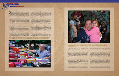
Here is a link to some random magazine, brochure and annual report spreads I have designed.

Sunday, August 12, 2012

Thursday, December 22, 2011
Sunday, August 29, 2010
Monday, January 19, 2009
RealPage 2009 User Conference
Apcreative: Design for Advertising, in partnership with Pat Beckman Advertising, designed RealPage's 2009 User Conference look. We designed the logo, website and a PDF brochure look. A screen capture of the site is below. Here is the link to the site.


Thursday, December 4, 2008
CD Cover Idea
I spent a couple of hours playing around with an idea for a CD cover for a band named Amid the Crash, a Christian alternative rock band.


Monday, November 17, 2008
Christian Alliance For Adoption Website
I have just finished designing the web site for Christian Alliance For Orphans.
Click here to see the site.
Click on the image below to see an image of the site.
Christian Alliance for Orphans is an organization comprised of partners that want to connect with YOU to help orphans around the world. They are a great resource for anyone, church or organization looking to connect to help make life better for orphans.
We had to have the basic site up by today and we made our deadline! We just started the process last Monday, so I am feeling good about what we were able to get done. It will need some tweaking and probably need some cleaning up, but take look at the site and let me know what you think.

Friday, November 14, 2008
Magazine Illustration
I do some illustration for the magazine Buckner publishes from time to time. Here are a few examples along with a few extra spreads to show context.


Thursday, October 9, 2008
Proposed Buckner Ad Campaign
In 2006, I designed this series of ads to tell the Buckner story from different perspectives. I wanted to convey to the reader that Buckner impacts people in many ways through its many and diverse ministries. Some of the ads tell how Buckner impacted mission trip participants. Some tell the story of people helped by the various ministries of Buckner. One even tells the story of how we sheltered a small Katrina victim in her time of need. I liked the idea of people telling the story of how Buckner impacted them because it's stories that move people to action. Plus, this campaign could utilize every area of our ministry - or focus on just one ministry. Each ad also ended with a call-to-action phrase to encourage the reader to get involved.
The campaign was never run in the format shown in the samples (you'll note that the body copy is mostly greeked - the ads never made it to the writing stage), but the next post below shows how the idea and look were eventually run in the form of our Go. Be. Do. ads.


The campaign was never run in the format shown in the samples (you'll note that the body copy is mostly greeked - the ads never made it to the writing stage), but the next post below shows how the idea and look were eventually run in the form of our Go. Be. Do. ads.


Buckner Go. Be. Do. Ads
The 2 ads below are the eventual culmination of the proposed ads in the post right before this one. 2007 was the dawn of a new era at Buckner with missions being the marketing focus. We chose the look from the above proposed ads, changed the focus to missions - hence the Go. Be. Do. theme and ran these ads in multiple publications such as Christianity Today and WORLD magazine.


Thursday, October 2, 2008
Buckner International President's Report
The next 3 posts will be selected spreads from this year's Buckner International President's Report that I designed. The square windows on the first few pages are actually die cut windows - which is why you see some photos more than once - you're actually seeing through to subsequent and previous pages through the die cut windows. This is much more effective when looking at the actual piece. There is also a fold-out map showing Buckner worldwide presence. Hard to show these features online!
There is an online version of this piece here as well


There is an online version of this piece here as well


Wednesday, October 1, 2008
Logos Logos Logos!
Below are some logos I have designed over the years. Feel free to ask me about any of them and hire me to design a logo for you!


Tuesday, September 30, 2008
Buckner 3x3 Displays
The below images on the next 3 posts are the series of trade show displays I designed for the 2008-2009 convention season for Buckner International. We all know how busy and cram-packed conventions can be, and with a limited budget I designed the displays using large, inviting faces of children, iconic images and bright lively colors to attract as much attention as possible. The images shown are Xpressions displays that are made of cloth and then stretched at odd and interesting angles on to the supporting display stand. Hopefully, I will be able to get some snap snap shots of the actual displays soon. There are 3 different sizes represented in the next 3 posts.


Saturday, August 16, 2008


Buckner Adoption and Maternity Services
This is a pocket folder used to send information to young women in crisis pregnancy situations that contact Buckner and request information about Buckner Adoption and Maternity services.


Aim For Success "Freedom to Succeed" Booklet
Aim For Success is a non-profit, Christian-based organization that gives presentations to students, teachers and parents in schools, churches and other organizations to educate them about choices pertaining to premarital sex. The presentations are based on the idea that they can be successful in life if they make wise choices regarding sex. The booklet shown is handed out to the students at the "Freedom to Succeed" presentations as a companion to the actual presentation - to remind them of what they've seen - a piece of the presentation they can take with them and refer back to. The imagery and text is very wild, wacky and kid-friendly.


Subscribe to:
Posts (Atom)
